Tuesday 4 October 2011

Task 2 colour for print.Packaging and promotion.

CMYK.


The flamboyant bowtie design embodies Parkinson’s quintessentially English personality while providing great standout and navigation on shelf. ‘The bowtie leapt out as a strong symbol of English exuberance and class. It also offered a vast array of colour and pattern to enjoy. (Designer: Jones Knowles Ritchie)


Matches with a striking strip right on the panty. It just feels great to “light your fire”. (Advertising Agency: BBDO Berlin)


A professional designer appreciates something that is attractive, surprising, new, simple and devoid of useless information. The Kleenex “slice of summer” boast all of this at once. This packaging shows great maturity, because the consumer is not bombarded with information that he neither really needs nor wants. (Designer: Hiroko Sanders)


Scanwood is Denmark’s largest manufacturer of wooden kitchen utensils, selling their products in Europe and the Middle East. The company wanted to communicate the fact that their products are made through an environmentally friendly process and are of course also made from all natural materials. (Designer: Goodmorning Technology)


Spot colour.


A kind of taste pack for oatmeal. This package contains the right amount of oatmeal with added sugar and salt. You break your BREAK FAST pack over a bowl, add water and cook in the microwave. Then you can tentatively serve with cold milk. The idea is to target a new audience that otherwise would not eat oatmeal, but also to those who are usually in a hurry in the morning and tend to skip today’s most important meal, breakfast. Break it fast and have a BREAK FAST! (Designer: Niklas Hessman)


Packaging design for a fun and twisted bubble gum brand. Beneath the cutesy exterior lies an unexpected twist: removing the outer box reveals the skeleton of each “bum”. (Designer: jjaaakk design)


New Ranger Extreme with extendable cargo bed. (Advertising Agency: JWT, Kuala Lumpur, Malaysia)


Creative product packaging idea from Japan. According to one Internet commenter “the packaging says “Black melon bread.” More like a pastry snack out of a vending machine than just a cookie.”


To boost the sales of a stylish shoe that’s already a cult product, Kempertrautmann agency created new packaging that made the brand even more desirable in terms of look and functionality. (Advertising Agency: Kempertrautmann)
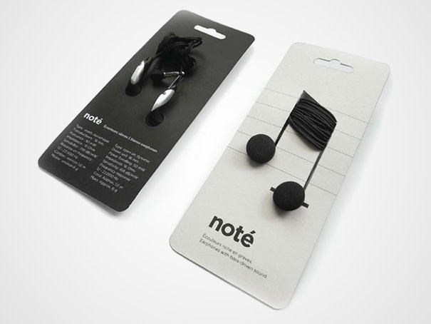


Monochrome.

The aim was to show the affected people that (plant-based) Nobilin has the power to aid digestion. Advertising Agency: BBDO, Germany.


Choosing plastic wrap for non-perishable is often a choice that is unjustifiable for the real needs of the product. To address this problem, Corinne Pant looked at the real needs of electronic parts packaging. In a poetic and very functional gesture, it shows us once again that “less is more”. (Designer: Corinne Pant)


No comments:

Post a Comment